Excel Blog
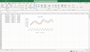
Line Graphs
April 1st, 2023 by BoxplotWhat Is A Line Graph? A line graph is a series of data points on an x–y axis, connected by a line. There are two kinds of line graphs: colored-in (also known as area charts) and standard. While the area under the line of a colored-in line graph is shaded in, the area under a standard line […]
Conditional Formatting with Excel
March 18th, 2023 by BoxplotConditional formatting is an Excel feature that allows users to customize the formatting of a single cell or group of cells based on whether a certain rule is satisfied. This feature is extremely useful in terms of automation, because the formatting of the selected cells changes automatically if the chosen condition is no longer satisfied […]
Histograms
March 12th, 2023 by BoxplotA histogram is a type of bar chart that shows the distribution ―i.e., the probability of a variable being within a certain range of values, out of all possible values― of a certain variable. For example, we can use a histogram to show customer wait times at a restaurant: This histogram indicates that approximately 4 […]

PivotTables in Excel
February 1st, 2021 by BoxplotWhat is a PivotTable? A Pivot Table is an analytics tool that can quickly answer key business questions. They are excellent at extracting insights from a vast dataset quickly. PivotTables are one of the most efficient and effective ways to evaluate large quantities of data in Excel. By “pivoting” or aggregating a large data table […]
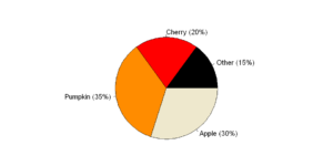
Pie Charts
September 4th, 2020 by BoxplotShow/Hide Code Introduction It seems as if people are split on pie charts: either you passionately hate them, or you are indifferent. In this article, we are going to explain why pie charts are problematic and, if you fall into the latter category, what you can do when creating pie charts to avoid upsetting those […]
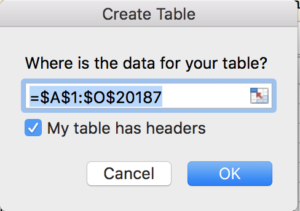
Tables & Linking Data Structures in Excel
September 1st, 2019 by BoxplotTables are one of the most important features of Excel, but are often overlooked. Tables and keeping analyses in Excel connected, will drastically increase your efficiency in Excel. Let’s start by understanding how they work with PivotTables. We’re going to use an R Dataset called DoctorContacts. Download the .csv file using this link (and save […]
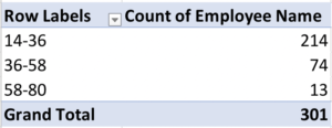
Grouping in PivotTables
September 1st, 2019 by BoxplotGrouping in PivotTables is a way of combining data to perform analyses without having to use functions. You can group numeric columns to turn them into categories, you can group date columns by date ranges to get even intervals, and you can group text columns to put together similar values. We’ll go through all three […]
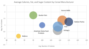
Make a Bubble Plot in Excel
September 1st, 2019 by BoxplotMost people don’t know that bubble plots even exist in Excel. In this blog post, we’ll walk through how to take advantage of these very effective charts! They are great for comparing three quantitative variables at once. For a nice intro to bubble plots, check out Hans Rosling’s very famous Ted Talk. If you don’t […]
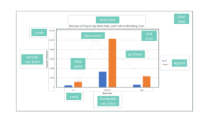
Formatting Charts in Excel
September 1st, 2019 by BoxplotFormatting charts in Excel is no easy task. It’s time-consuming, and Excel is pretty fussy which doesn’t make things easier. In this post I’ll give general tips for formatting charts, and also go over a few common scenarios. Understand the Parts of a Chart First thing’s first: it’s important to get the syntax down pat […]
Excel File Setup for Analysis
September 1st, 2019 by BoxplotExcel gives you a lot of flexibility when creating files and starting projects, and we’re often asked what the “best” solution is for keeping things organized. This post will review what we recommend. As with everything in life, there may be a few exceptions where you’ll want to set up your file differently. However, this […]